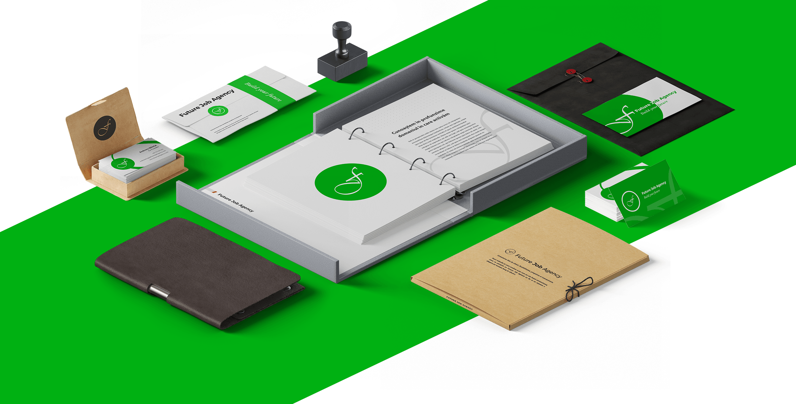
Future Job Agency
Build your future

Description
A human resources company which offers services for staff management (staff leasing), recruitment and selection, management of staff files and payroll, and consultancy in the domain of human resources. Their objective is to offer their partners strategies and innovative ideas for possible problems related to human resources.
Challenge
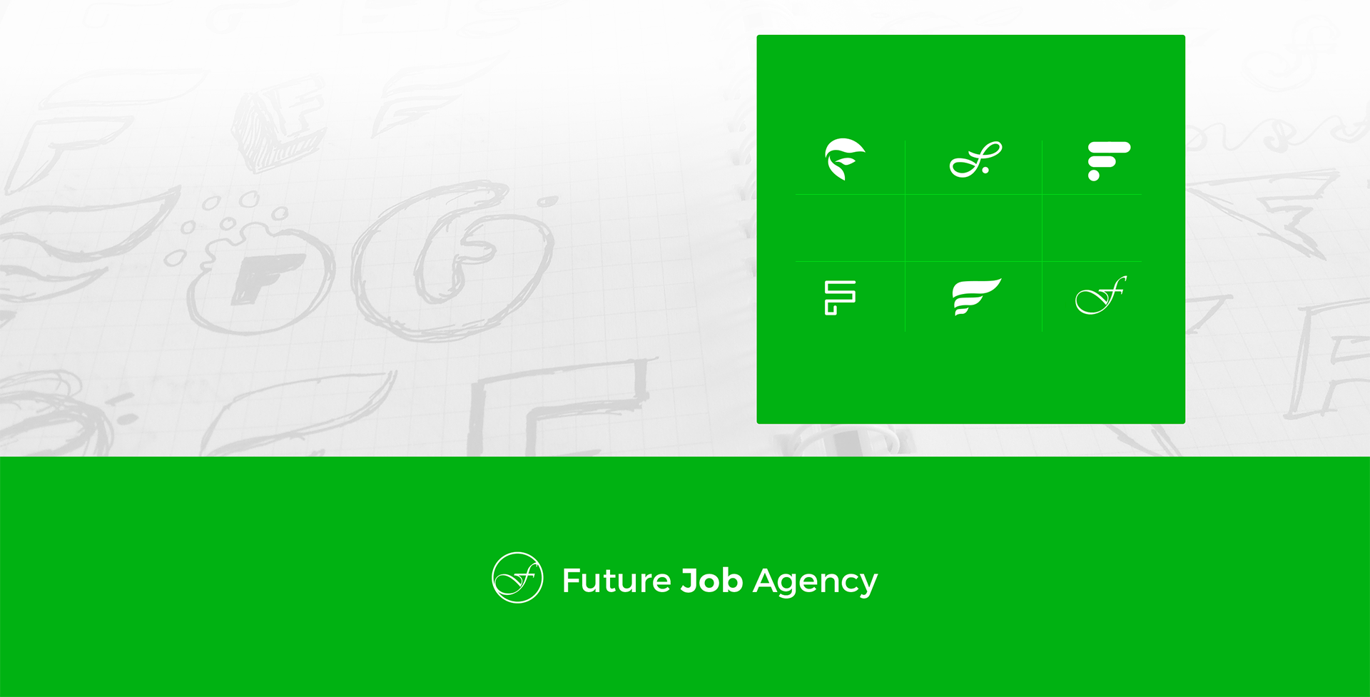
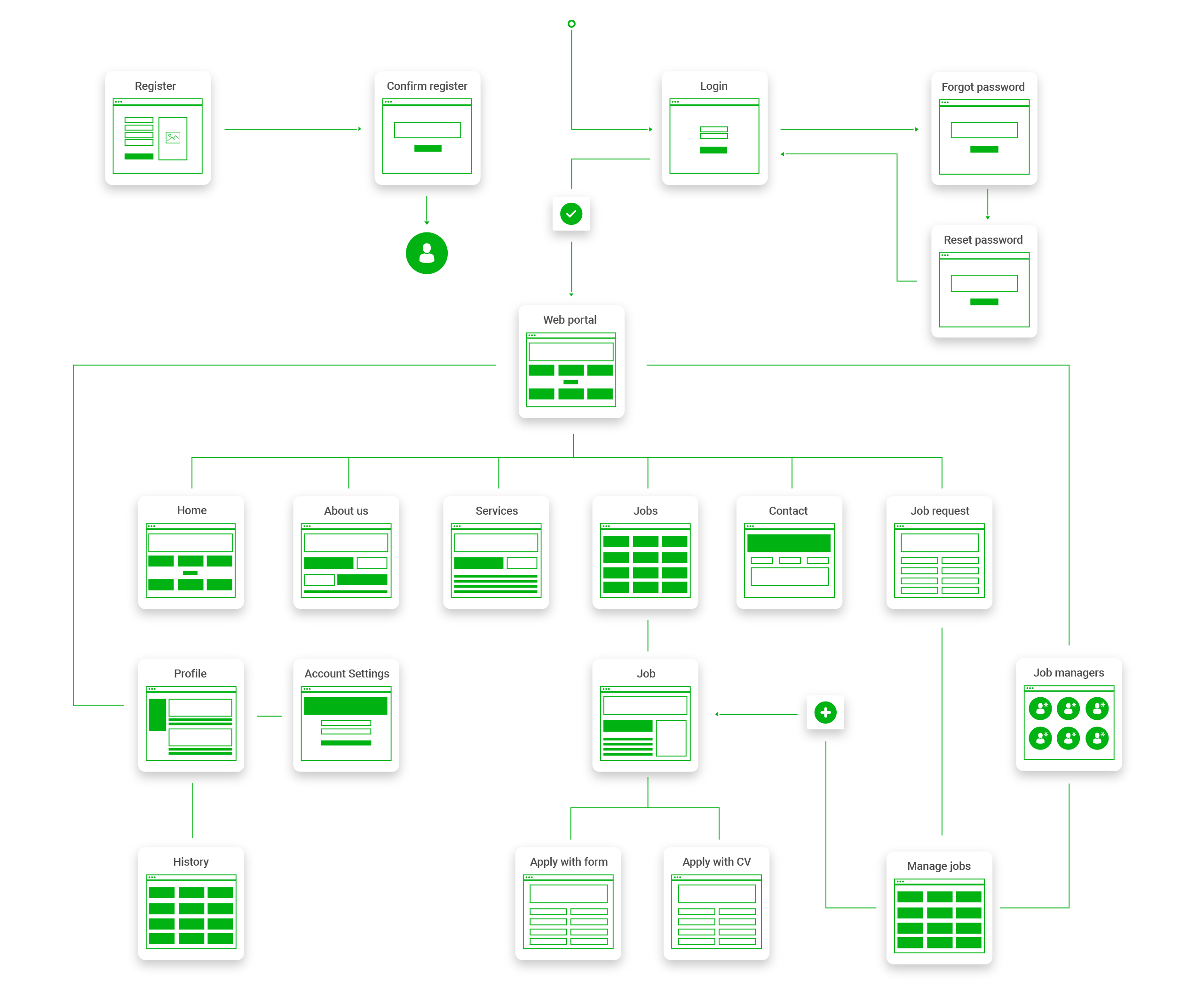
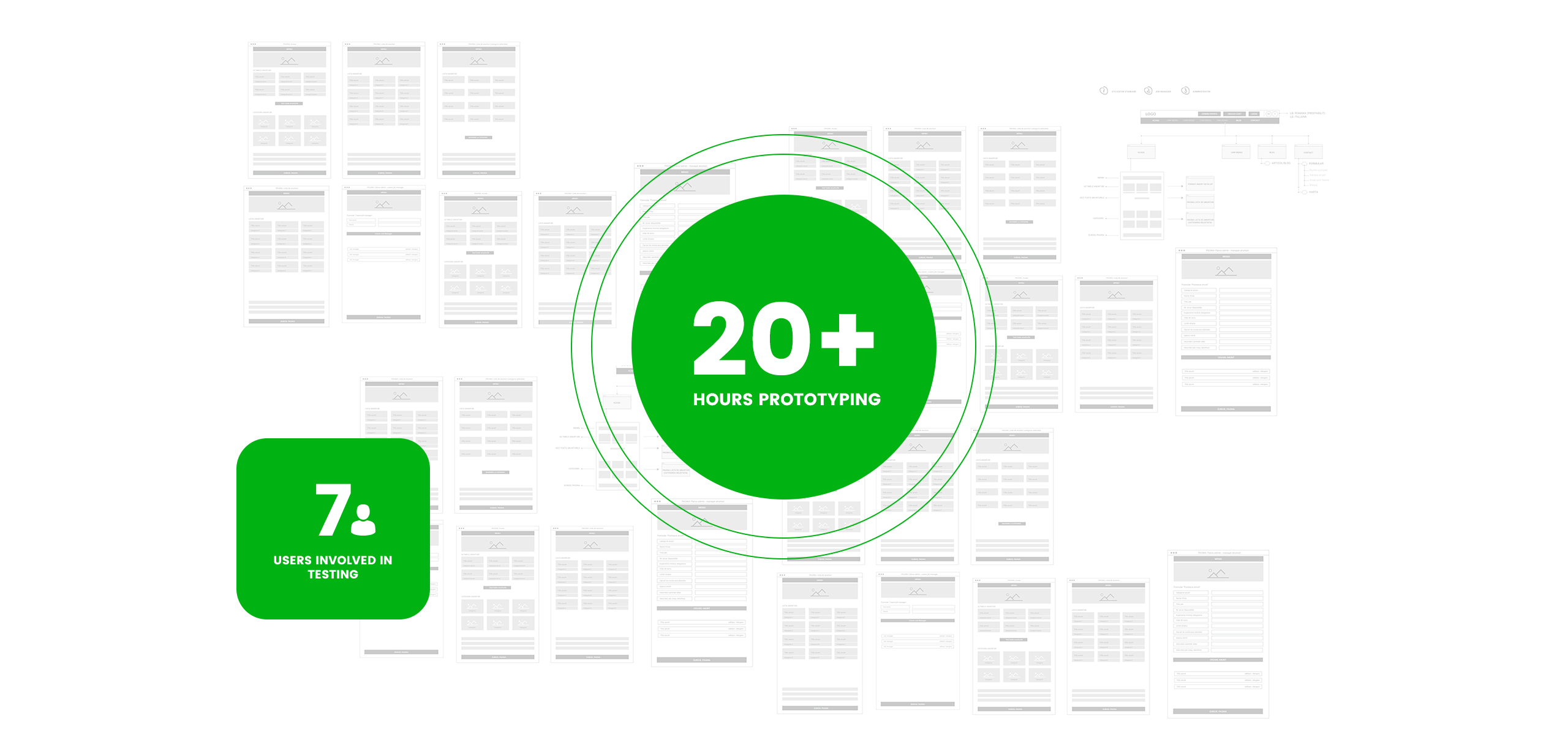
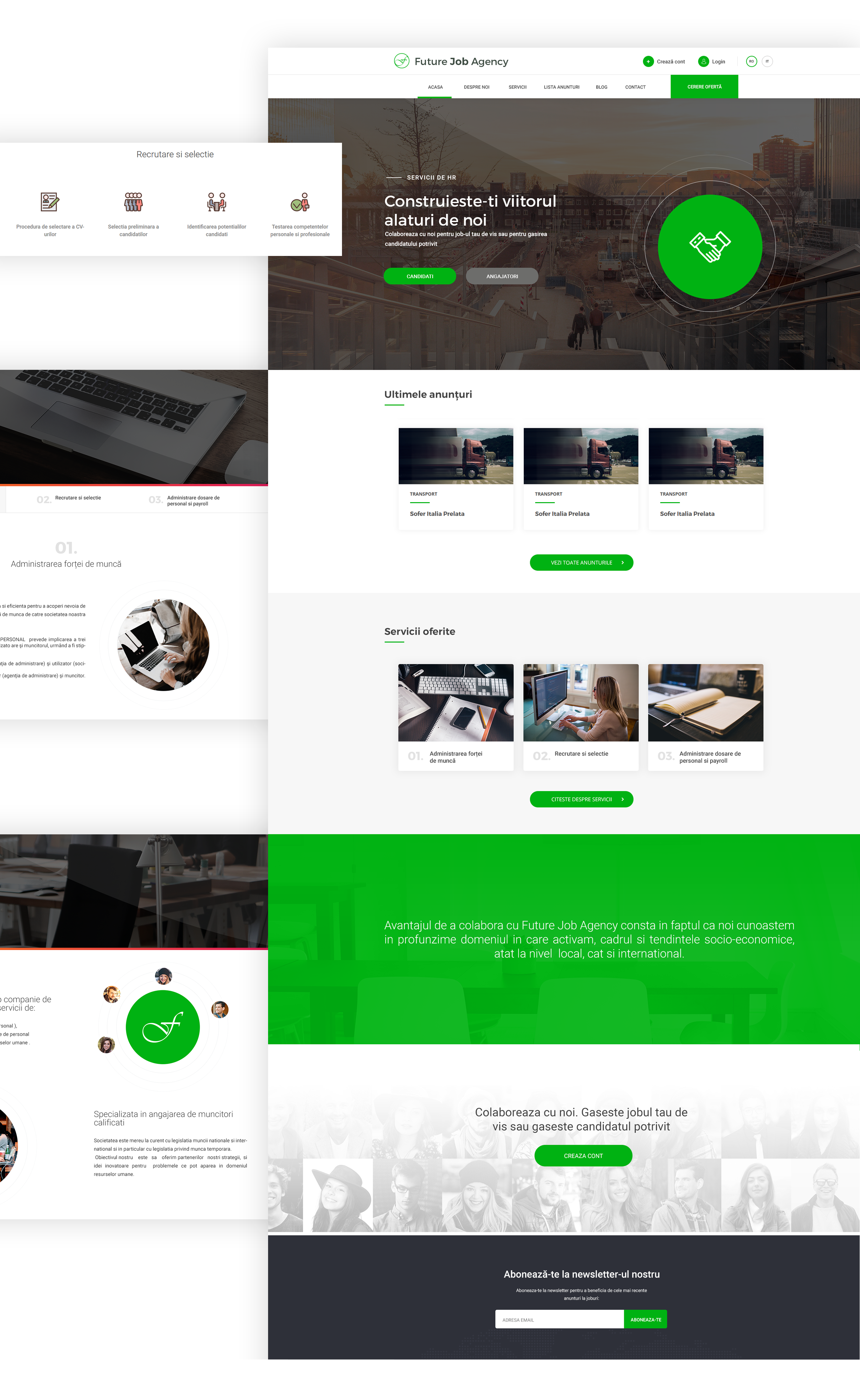
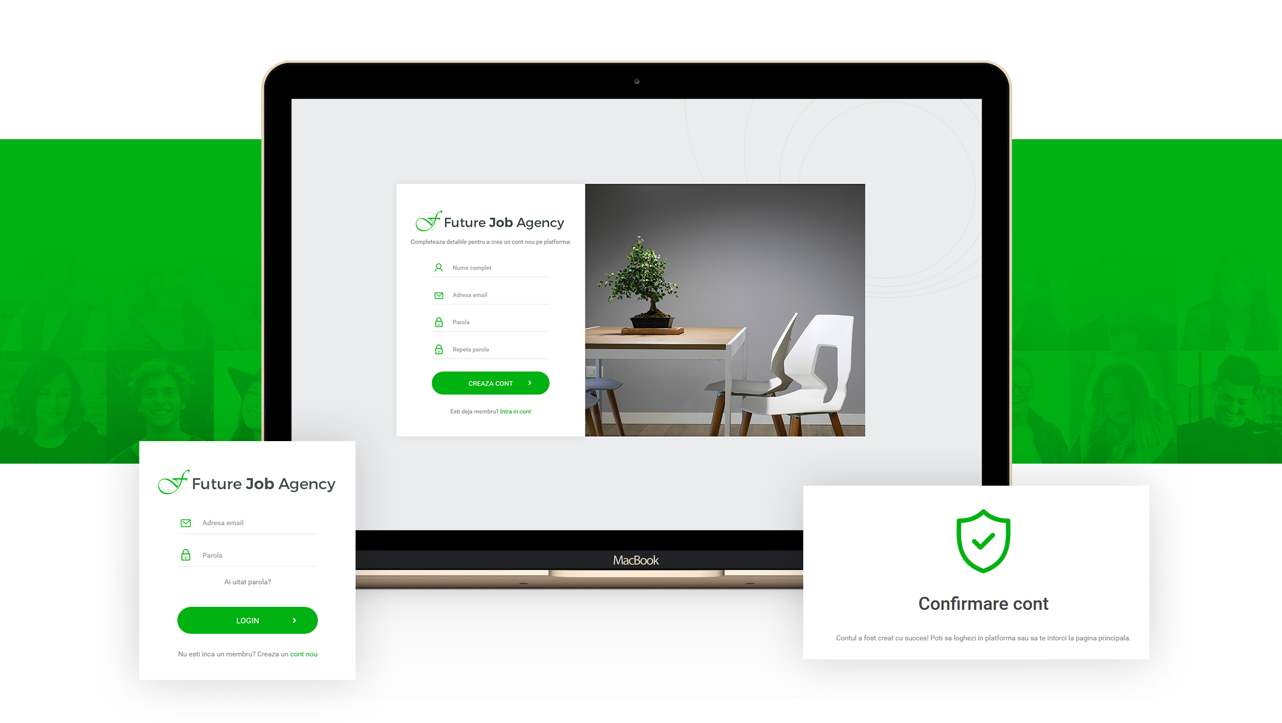
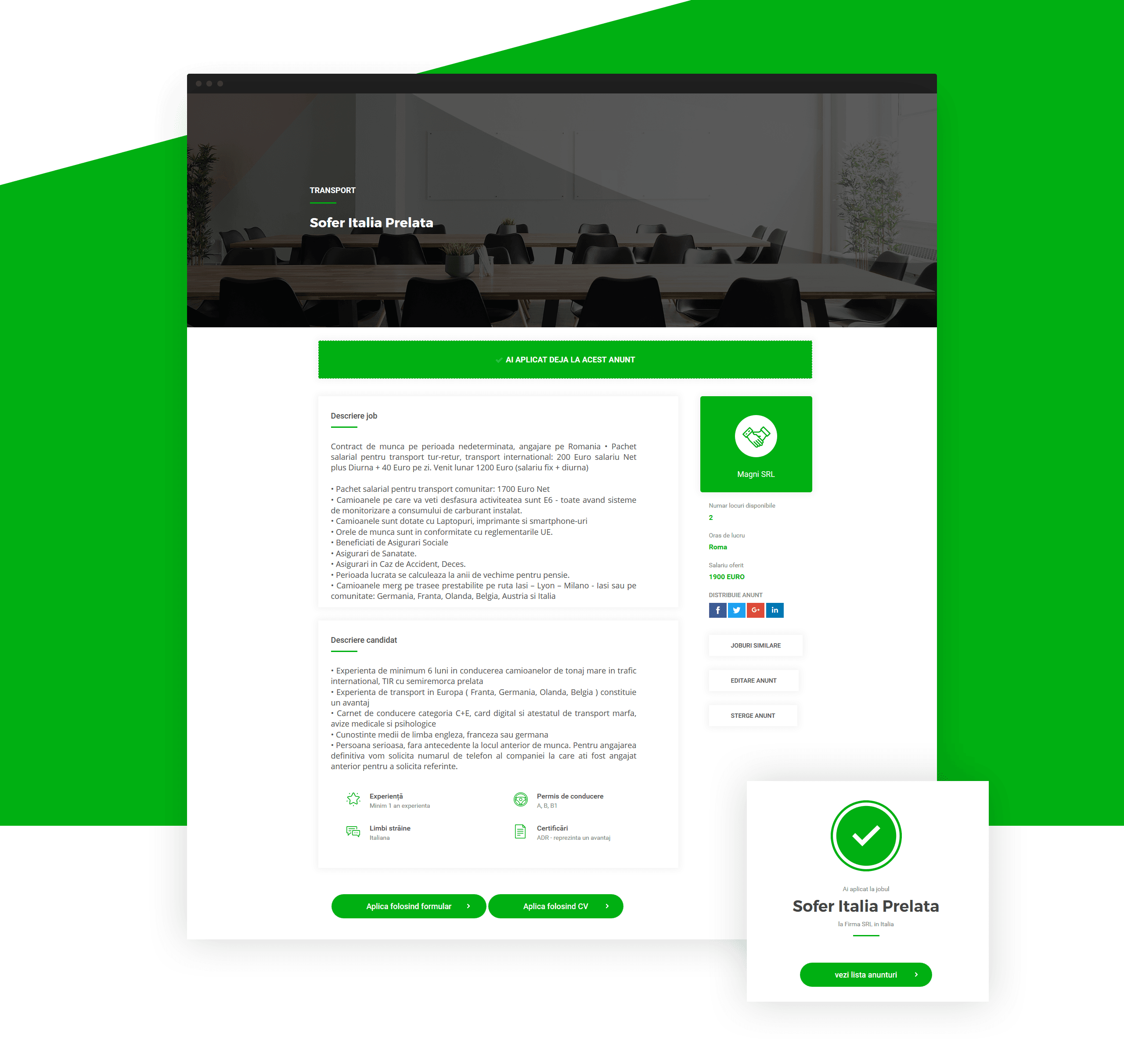
The agency needed an easy way to display and manage the job ads they want to promote, while also introducing visitors to their services. We had to design and develop a multilingual hybrid website, serving both as a presentation website and a job portal. The first step was to validate their expectations by creating wireframes. We then established the creative direction of the project, which enabled us to design the logo and the website. After the design was approved, we implemented all the necessary pages (including responsive behaviour) and functionality according to the agreed requirements. The last phase was to test the application and train the administrators on how to use it.
What we did
Design
Concept
User experience
Interaction model
User experience
Wireframes
User interface
Design
User interface
Responsive design
Style guide
Color
From the perspective of color meanings, green is a lively color, and it symbolizes renewal and growth. This is a color that has a strong sense of right or wrong, inviting good judgment. It sees both sides of the equation, weighs them up, and then usually takes the moral stand in making appropriate decisions. Green is the color of prosperity and abundance, of finance and material wealth.
Primary color
Secondary color
Style guide
Typography
AaBb123
AaBb123
Style guide
Iconography
Branding
